Skip to content
 What Is A Burn-Up Chart? And Its Importance in Project Management

Project managers employ various charts and graphs to display the project’s state and progress, making it easier for the stakeholders to comprehend. However, a Burn-up chart can be significantly more beneficial then others, especially when it comes to managing projects
They can help enable the project’s stakeholders to analyze its advancement and see the timeline, issues, and budget. One of these charts is the burn-up chart, a simple tool that supplies project managers and other stakeholders with essential information.
What is a burn-up chart?
Burn-up charts are used to monitor the growth of tasks on an individual scale. They depict the finished and balanced work, along with lines that indicate the amount of work done.
This chart is typically utilized in Scrum and agile project management. The burn-up chart assists project managers in keeping track of their projects. It is used in other fields, such as engineering or software development, in which task charts are used to keep track of the progress of projects.
A burn-up chart shows how the project is progressing and what further enhancement we can expect. It also shows how likely a project will be completed within the timeframe. The information in the chart is clear, basic, easy, and simple to understand.
It’s a fantastic tool for communicating the project’s progress to those involved. Burn-up graphs make monitoring the project’s progress easy and let stakeholders know whether the project needs correction or preventive actions, or adjustments.
Burn-up charts start at the beginning point and change with the project’s progress. It is displayed on a timeline compared to the time in order to determine patterns or anticipate delays.
How to read a burn-up chart?
To understand how to read a burn-up chart, let’s take a look at this reference image below:
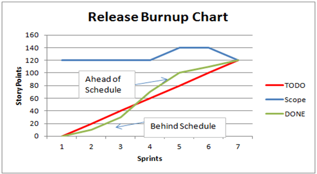
- The horizontal axis indicates the total time of the project or its iteration. It shows what work has been completed to the present working day (project tracker line).
- The vertical axis is the entire amount of work, with either story points or working hours. It is the ideal route toward completion. It is the total work needed to meet the goals set for the project or Sprint (full working line).
For example, if you’re planning to research how to sell on Etsy, you might also want to consider paying close attention to your business’s burn-up chart to see if you’re heading in the right direction.
How to create burn-up charts?
The process of creating burn-up charts is a straightforward procedure if you adhere to these suggestions:
- Determine what the X-axis symbolizes: The X-axis is the horizontal line at the bottom of the burn-up chart. This axis usually represents duration, as long as the legend states it.
- Determine what the Y-axis is: The vertical or diagonal line that runs across the burn-up chart usually represents what remains to be completed. You can also define this in the legend of the chart.
- Label the lines clearly: If the chart you’re looking at doesn’t include an accompanying legend, it may be beneficial to make one, with each line outlined at the top or bottom of the diagram. This will help you save time when an employee needs to refer to the chart.
- Connect the dots: When you create a burn-up chart, each time that progress is made and the lines advance, you can add an asterisk to mark where the X-axis of the project has advanced to. Connecting the dots by lines may help visually depict the progress made in the project.
Burn-up and burn-down chart – what’s the difference?
The burn-up and burn-down charts could appear as similar concepts on paper. However, while they may appear identical, their distinct features allow for different use scenarios. The main difference is how you define the timeframe.
Burn-up charts begin at zero, while burn-down charts tend to move toward zero. This is why burn-down charts are essentially based on the fact that there is a deadline.
Burn-up charts don’t stress the deadline but rather concentrate on the accomplishments in the meantime as time goes by. You can utilize this to your advantage by choosing one depending on the kind of project you’re involved in, the people in the project, and various other aspects.
There are a few more distinctions between burn-up and burn-down charts, which include:
1. Focus tracking
The main distinction between burn-up and burn-down charts lies in the project aspects they monitor. Burn-up charts keep track of every task completed at various stages of the project and highlight every part of the project’s time frame. On the other hand, burn-down charts record how much work is required to complete the project.
2. Lines of the line
There are a variety of lines shown in burn-up charts, as well as burn-down charts. Burn-up charts could have up to three lines to monitor different elements of a project. Burn-down charts include only two lines to track the amount of work needed to finish a task and the amount of effort.
Use cases for burn-up charts
Burn-up charts have an open-ended timeline by default since they track the time that has passed instead of counting to zero. This means that you can use burn-up charts to keep track of more flexible projects, have numerous dependents, or have complications in that the timeline and scope may be subject to change throughout the project.
Use cases for burn-down charts
If you’re working with a particular, finite timeline, the burn-down chart will aid in identifying and fixing issues early. Any interruption to the timeline, regardless of whether it puts you ahead or behind, is evident as a distinction across the lines.
A burn-down chart is a good choice as you’re calculating the time, work, and scope adjustments that will appear as low productivity. For instance, starting an Etsy print-on-demand store is a progressive business idea. We would also need to follow the graph to see if it increases horizontally.
But an undertaking with uncertainty, potential adjustments, and external influences can make a poor option for a burn-down chart.
Key benefits of using burn-up charts
Using burn-up charts as part of your business plan has many benefits. They serve the purpose of monitoring the efficiency and progress of your projects as well as for tracking project progress, such as:
- Monitoring the overall progress of the project
- Measuring the amount of work to be completed in an undertaking
- The tracking of expected project progress within a specific period
- The percentage of a project that is completed at any time
- The scope of the project is depicted
- Displaying how the project is operating
- Determining if the project’s timeline is in line with the deadlines required
How do burn-up charts assist in facilitating agile project management?
Burn-up charts form an integral element of agile project management. Here’s how:
1. Keep track of what you’ve accomplished with each Sprint
Burn-up charts make monitoring the sprints you are running simple. When you track your progress over time, you will determine which areas you made the most significant gains in and when things were slowing down.
This could also be helpful for team members working in Scrum. In their weekly meeting, the scrum master can review their work to determine what went wrong and devise solutions with the scrum team.
2. Monitor your project scope
Contrary to other similar charts, burn-up charts track your project scope. This provides context when you’re evaluating your project’s performance.
If you notice a project taking more time than anticipated, look at your scope lines to determine the scope change. This can explain the delay, even though nothing seemed to be in the wrong place.
Knowing your work’s scope is extremely helpful in proving delays to stakeholders and customers. If a customer is worried about how long the project will take, a project manager could highlight the deviation from the timeline and thus explain the reason for the scope increase.
What is the best burn-up chart tool for agile project management?
Nifty is the best burn-up chart tool for agile project management.
This web-based management tool can satisfy all your requirements for managing your projects.
You can design goals (Gantt charts) to track your project and keep track of time spent on projects to analyze the performance to gauge the efficiency of your staff in real-time.
Here’s a handy article about best Gantt chart tools.
Here are a few options this tool offers for managing projects:
- List View
- Calendar View
- Gantt Charts View
- Table View
- Board View
With the numerous options offered by Nifty, everyone can work according to their unique preferences.
Conclusion
It is possible to use both burn-down charts and burn-up charts simultaneously to keep track of your project’s progress. Utilizing both charts is particularly useful because both can show distinct aspects of a project.
Combining burn-down charts and a burn-up chart for multiple projects could also provide insight into your work patterns when compared over time.
However, burn-up charts can be among the most effective ways to track your agile project’s development. In addition, you cannot control the growth of agile software without the proper project management software. It includes everything you require to control your burn-ups, sprints, and burn-downs to ensure your project runs efficiently.
Sign-up on Nifty to help you assist with your project management using Gantt charts, tables, tasks, burn-up charts, burn-down charts, and more.