Skip to content
 Burndown Chart Excel: Quick Steps to Make It [2026]

Looking to create a burndown chart in Excel?
In this article, we’ll explore what a burndown chart is, how to make one in Excel, and why using a project management tool like Nifty offers a much better solution for automating progress tracking in real time.
Burndown chart is used by agile project managers to track their projects. This makes it easy to determine, whether things are going according to plan and if you’ll be able to meet your deadline and reach your objective.
Burndown charts are one of the easiest ways to track your project’s progress in relation to its goals and deadlines. While for many teams, Microsoft Excel is the preferred method, the easier way is to use a visual project management software like Nifty to automate progress tracking in real-time.
What is a Burndown Chart?
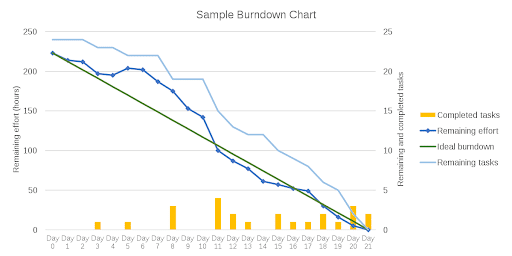
A burndown chart is a visual representation of the amount of work remaining over time, often used in the context of data analytics trends. It’s commonly used in agile project management (especially Scrum) and other agile workflow lifecycles for software development to track progress and ensure projects stay on schedule. The vertical axis shows the amount of work left, while the horizontal axis shows time. The two lines on the chart typically represent:
- Ideal Work Line (Green): The perfect estimate of how much work should be completed each day.
- Actual Work Line (Blue): This represents the actual progress made. It fluctuates based on real-world challenges or delays.
Burndown charts help project teams estimate how long a project or sprint will take to complete. They’re updated daily to reflect real-time progress, giving everyone an instant view of project health.
Here you can see a sample of a burndown chart:
Types of Burndown Charts:
- Sprint (Release) Burndown Chart: Tracks work left in a specific sprint.
- Product Burndown Chart: Shows progress for the entire project.
Why Use a Burndown Chart?
- Track Scope Creep: Ensures project scope doesn’t expand unintentionally.
- Maintain the Team’s Schedule: Keeps teams aligned with project deadlines.
- Compare Planned Work vs. Actual Progress: A visual aid to see if the project is on track.
How to Create a Burndown Chart in Excel
Yes, you can create a burndown chart in Excel by following a few steps. Let’s say you’re tracking a 10-day sprint with 10 tasks. Here’s a simplified guide:
1. Create a Table
Start by organizing your data in a table, which will serve as the foundation for your burndown chart. Here’s how you can structure it:
- Column 1: Dates – This column will represent each day of the sprint (Day 1, Day 2, and so on, up to Day 10).
- Column 2: Estimated Tasks (Planned Effort) – This will show how many tasks you expect to complete by the end of each day. For example, you may want to complete 1 task per day in a 10-day sprint, with all tasks finished by the end of Day 10.
- Column 3: Actual Tasks (Actual Effort) – This column will record the number of tasks actually completed by the end of each day.
Once you have your columns laid out, start filling in the data. For instance:
| Date | Planned Tasks | Actual Tasks |
|---|---|---|
| Day 1 | 9 | 9 |
| Day 2 | 8 | 7 |
| Day 3 | 7 | 6 |
| … | … | … |
| Day 10 | 0 | 0 |
This table lays the groundwork for your sprint burndown chart, allowing you to easily visualize progress as you go.
2. Add Planned Tasks Data
Next, you’ll enter your planned tasks data into the table. This data reflects the number of tasks you expect to remain at the end of each day. Keep in mind that this is your ideal work progression, so it won’t account for any unforeseen delays or challenges.
For instance:
- Day 1: 9 tasks remaining
- Day 2: 8 tasks remaining
- Day 3: 7 tasks remaining
- And so on until Day 10, when you expect to have 0 tasks left.
Your actual tasks column should be updated daily as your team completes tasks. At the end of each day, record how many tasks remain in your sprint. This will give you an accurate picture of how your team is progressing compared to your plan.
3. Create the Burndown Chart
Now that your table is ready, it’s time to create the burndown chart. Excel makes this process easy with just a few clicks:
- Select Your Data:
- Highlight the three columns containing the dates, planned tasks, and actual tasks.
- Insert a Line Chart:
- Go to the Insert tab in the top menu of Excel.
- Choose Line Chart from the chart options.
- Select a basic line chart from the drop-down menu.
- Format the Chart:
- Customize the chart by adding titles, adjusting the axis labels, and selecting colors for the planned vs. actual task lines. The green line typically represents planned progress, while the blue line shows actual progress.
Once you’ve completed these steps, your burndown chart will give you a clear visual of your sprint progress. If your actual tasks line closely follows your planned tasks line, your sprint is on track. If the lines diverge significantly, you may need to adjust your workload or expectations for the remaining sprint days.
Limitations of Excel for Burndown Charts
While Excel is a powerful tool for creating burndown charts, it’s not without its drawbacks:
- Time-Consuming:
- Manually entering data into Excel can be tedious and time-consuming. This contradicts the purpose of a burndown chart, which is supposed to give quick, real-time insights into progress.
- Prone to Errors:
- Data entry mistakes are easy to make, and a single error can skew the entire burndown chart, misleading your project team and management.
- Lacks Collaboration:
- Excel is basic and not designed for team collaboration. Sure, you can share the sheet, but it lacks real-time communication features that project teams need to stay aligned.
- No Mobile Support:
- Excel doesn’t offer robust mobile compatibility, making it difficult to access or update burndown charts on the go.
Why Nifty is the Better Alternative for Burndown Charts
If you’re tired of manual processes and the limitations of Excel, it’s time to switch to Nifty, a modern project management tool designed to help you focus on what really matters—getting work done.
Here’s why Nifty is a better solution for creating and managing burndown charts:
- Real-Time Progress Tracking:
- With Nifty, burndown charts update automatically in real-time as tasks are completed. No manual input is required, saving you hours of work each week.
- Task Management:
- Organize and manage tasks with customizable boards, lists, and views. Task completion feeds directly into your burndown charts, giving your team and stakeholders immediate insight into project health.
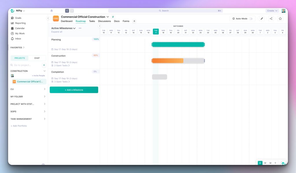
- Milestones and Timelines:
- Use Nifty’s Gantt charts and milestone tracking to visualize your project’s progress and set clear goals for the team. Every completed task adjusts your burndown chart accordingly.
- Collaboration Made Easy:
- Unlike Excel, Nifty supports real-time collaboration with built-in chat, comments, and even video meetings. All communication stays linked to tasks, ensuring transparency across the team.
- Mobile and Remote Access:
- With Nifty’s mobile app, you can manage your burndown charts and project tasks on the go. Whether you’re in the office or working remotely, your team stays aligned.
- Error-Free Automation:
- Nifty’s automation ensures you avoid the human errors that often plague manually created Excel burndown charts. With Nifty, every update is accurate and instantly reflected in your reports.
- Visual Reports and Overviews:
- Get a birds-eye view of all your projects with Nifty’s visual reports. See project health, timelines, and team workloads at a glance—something an Excel spreadsheet simply can’t match.
👉 Ready to try Nifty? Get started for free.
Conclusion: Nifty vs. Excel for Burndown Charts
Excel is a powerful tool for data management, but when it comes to burndown charts, it’s slow, manual, and prone to errors. If you’re a project manager trying to stay agile, spending time manually inputting data into Excel is a thing of the past.
Nifty, on the other hand, automates the process, offers real-time insights, and provides a full suite of project management tools—all in one place. Whether you’re tracking a sprint or an entire project, Nifty helps you stay on top of your work without the hassle of spreadsheets.
✨ Ready to streamline your burndown charts and project management?
👉 Sign up for Nifty for free and easily take your projects to the next level!