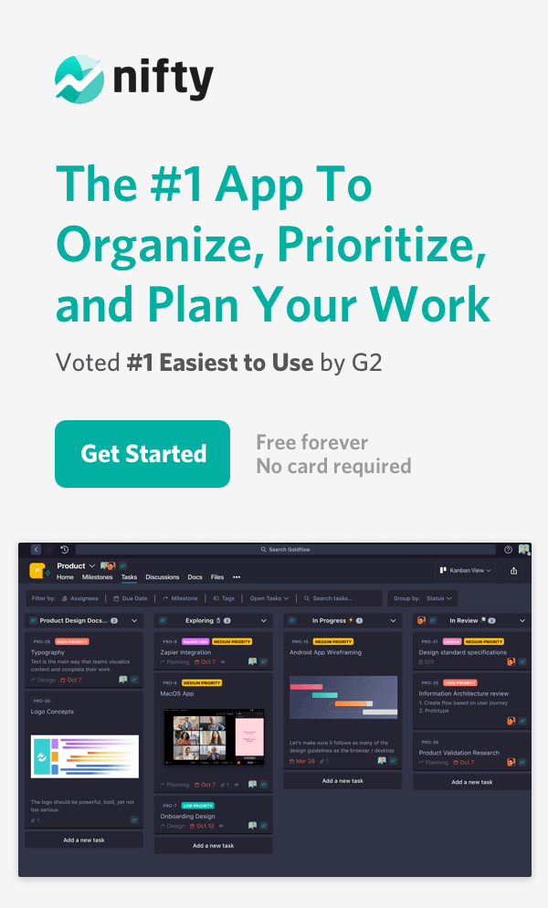
Skip to content
 15 Most Popular Project Management Charts in 2026

A typical project in today’s digital world is more complicated than ever. Understanding core data points using project charts is incredibly important to deliver successful project outcomes.
According to The Standish Group’s CHAOS report, approximately 66% of projects fail in the software industry alone. Failed projects result from poor planning, miscommunication, and a lack of insight during project execution. Projects that fail to meet expectations come in late or run over budget, resulting in lost time, money, and employee burnout. A good project management chart can go a long way to managing projects successfully.
Most projects will require multiple types of charts along with project milestones for successful completion. Enrolling in a top PRINCE2 certification course will certify you for different charts management. Let’s start by looking at what exactly project charts are and how they can help in the planning and execution of a project.
What is a Project Chart?
Before diving into project management charts, let’s define project management. A project is defined as a one-time (non-repeating) endeavor that consists of a series of tasks and a defined goal. Project management uses methods, processes, and tools to ensure that a project is progressing and meeting agreed-upon objectives. A project management chart is a visual representation of the data being moved in a project.
Project management charts are one of the most helpful tools a project manager can use because they organize vast amounts of data into a readable format that gives valuable insights into a project’s progression.
Top 15 Project Charts
Now that we’ve learned what a project management chart is and what the benefits are, let’s take a look at the 15 most popular options.
1. Gantt Chart (Roadmap Project Chart)
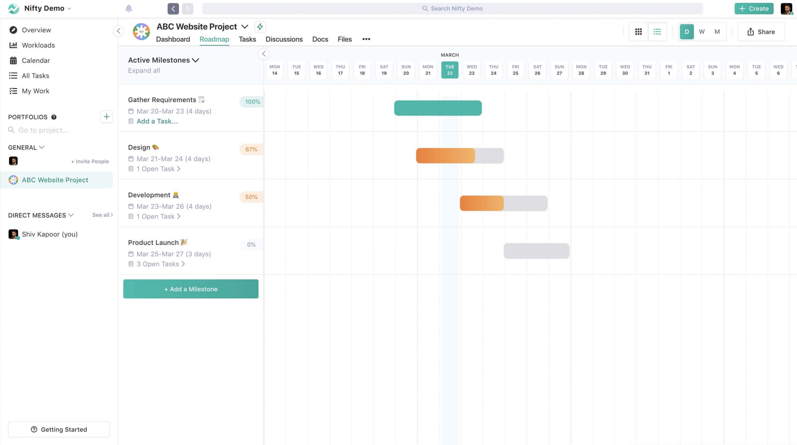
A Gantt chart is the most recognizable and popular project management chart. Nifty’s Gantt Chart is mainly a Roadmap view of goals and milestones that shows you at a glance how the tasks for each project are progressing and how departments, team members, and activities are working together. You will see the tasks along the y-axis of a Gantt chart; along the x-axis is the time passed and project milestones.
Pros: The pros of using Nifty’s Gantt charts are easy to use and will allow you to assign tasks, set dependencies, and track progress in one place.
Cons: The typical cons of Gantt charts are that they require more effort for creation than some other charts, and they don’t allow you to see all of the tasks in one view. However, Nifty delivers dynamic Gantt Chart ability, making charting one of the easiest ways to manage your project schedules and resources.
Ideal for: Automating your progress reporting, managing tasks, dependencies, and aligning all stakeholders on your project schedule.
Build and visualize your projects with Gantt charts! ✨
Get Started with Nifty for Free
2. Timeline View (Gantt Project Chart)
A timeline, as you might imagine, is a chart that shows the planned and actual progression of the entire project from beginning to end. This visualization highlights milestones and mission-critical events that are time bound so that PMs can see if a project is on track at a glance.
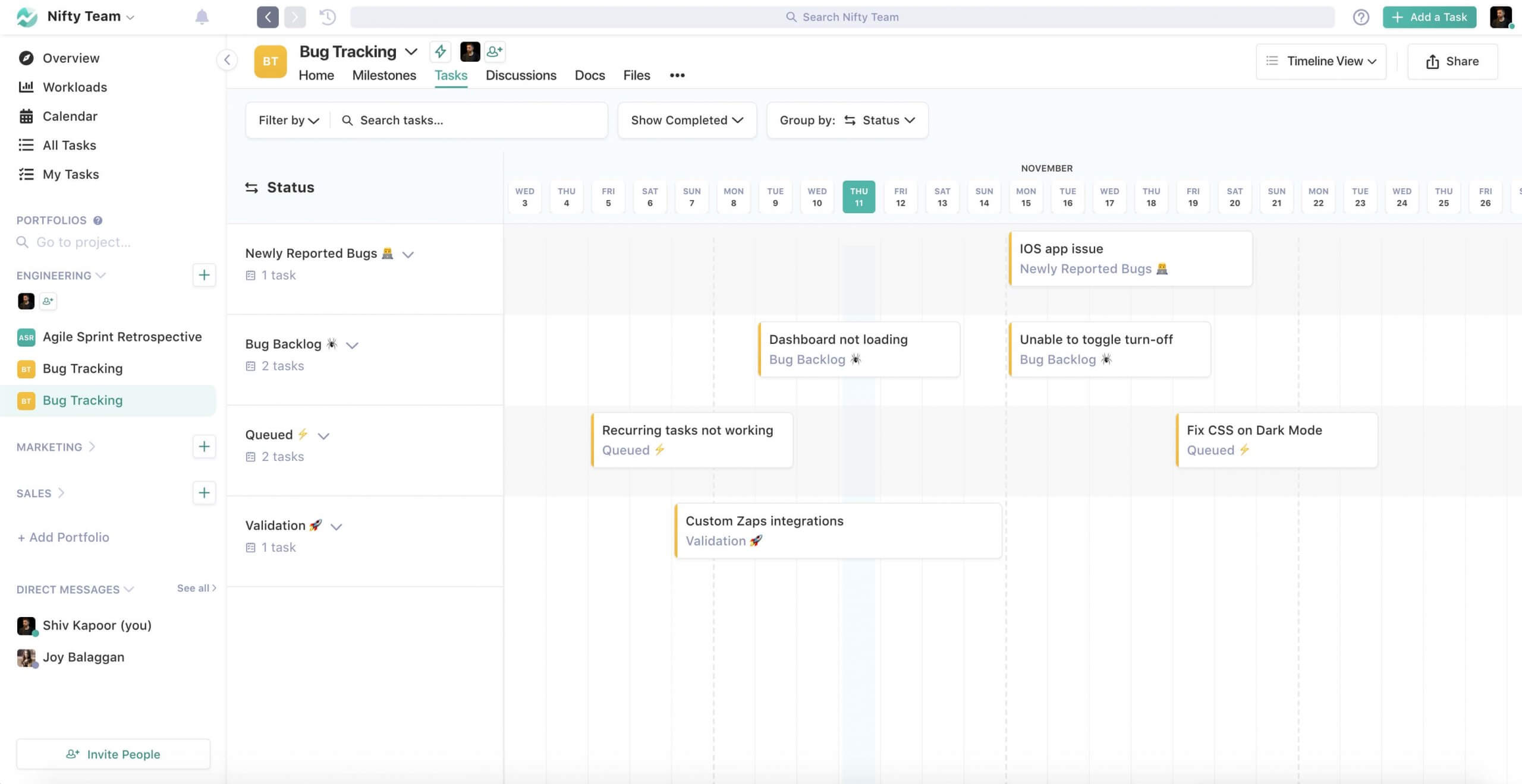
Pros: The pros of a timeline are that it is flexible. Nifty’s timeline view can be detailed with hundreds of tasks or simple with only significant tasks and milestones. A timeline gives a simple bird’s eye view of the entire project.
Cons: The cons of a timeline view are that it gives little actionable information. It may show that a project is behind schedule, but it needs to provide more details on the issue. However, with Nifty’s progress automation, if a milestone exceeds its end date while having open tasks attached, the milestone bar will turn red to let everyone know that it has become overdue.
Ideal for: Projects that have a strict deadline.
Get started with Nifty’s free plan and create a timeline view in minutes! ✨
Sign up for free
3. Kanban Board (Agile Project Chart)
A Kanban or Scrumban board is a type of workflow visualization that is made up of status columns and task cards. In Nifty’s Kanban board, each column represents an activity or status such as “To Do” or “In Progress,” while each card represents a specific task that needs to be completed. Cards can flow from one column to another to create a workflow process.
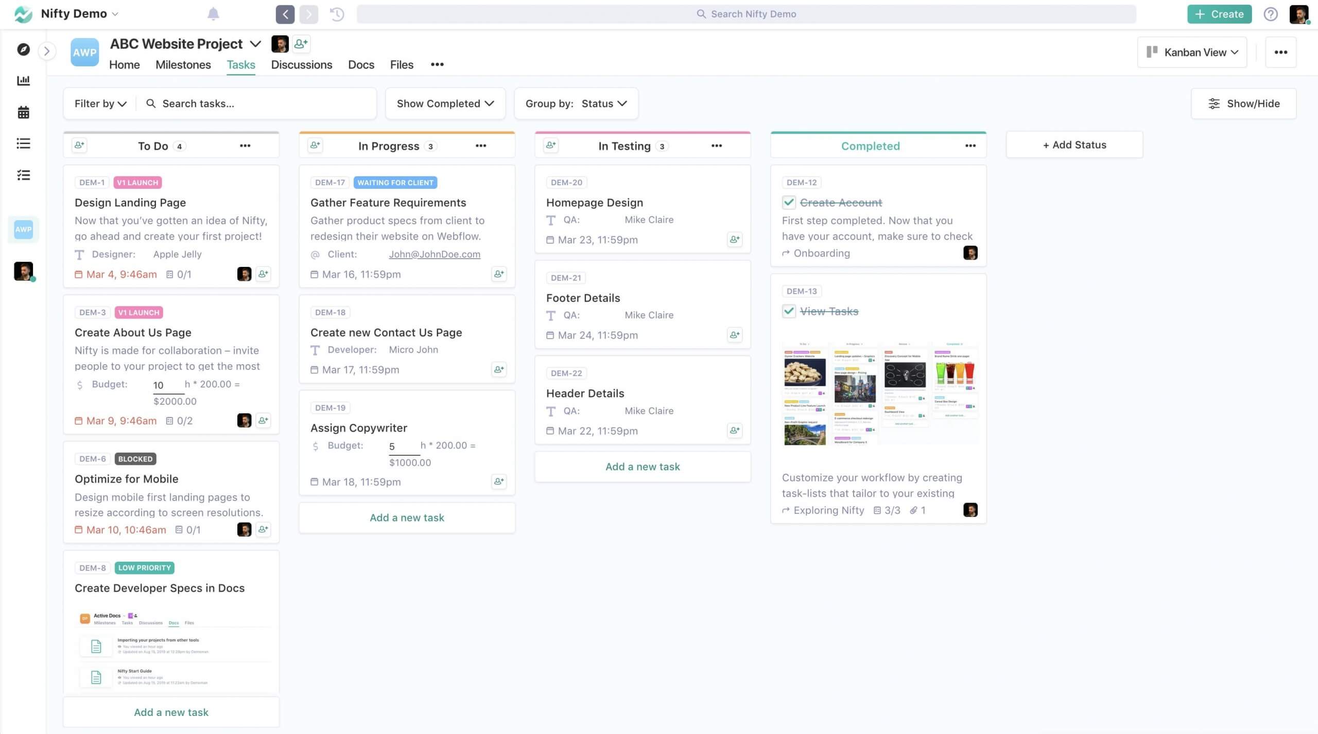
Pros: Kanban boards are flexible and customizable to fit the project’s needs. Nifty’s Kanban boards are robust, flexible, and great for encouraging team collaboration and identifying bottlenecks and checkpoints in the workflow.
Cons: It is impossible to add a table-like view to adjust information on the go, like using a list view.
Ideal for: Projects with small to large size teams who need to collaborate and visualize progress through their funnel journey.
Create your Kanban board for free with Nifty—get started today! 🚀
Get started for free
4. PERT Chart (Most Popular Project Management Diagram)
One of the most popular project management diagrams is a PERT chart. PERT is an acronym for Program Evaluation and Review Technique. A PERT chart is in a diagram format and uses circles, arrows, or lines to represent the milestones and activities involved in a project.
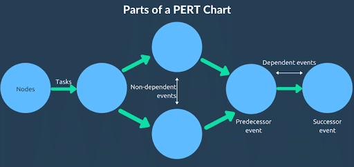
Pros: The pros of using a PERT chart is that you can easily track activities and tasks that have uncertain time frames. Additionally, you can see non-critical parallel activities.
Cons: The cons of a PERT chart is that they are a little complicated to read at first. They also aren’t as good for tracking tasks that are time bound.
Ideal for: Projects that involve many tasks with uncertain time frames.
5. Work-Breakdown Structure (WBS) Chart
A work-breakdown structure chart organizes a project into levels. The first level is the broadest and most general. It might be the main task or the overall project. The following levels break down the first level more and more into smaller tasks or budgets.
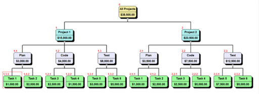
Pros: The pros of a WBS chart is that it can help you simplify and plan out a large complex project. It works well for breaking down a budget.
Cons: The major downside to a WBS chart is that you can’t see the task dependencies or timeline of a project.
Ideal for: Any project that can be logically broken down into smaller parts.
6. Flowchart
A flowchart uses boxes or other shapes, arrows, and colors to visually represent the progression of a project. For a minor team project with complicated workflows, a flow chart can simplify things and get everyone on the same page.
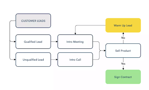
Pros: The pros of using a flowchart software are that it presents a project’s steps and processes in a graphic way which is especially helpful for visual learners. You can customize flow charts as needed to incorporate branding materials, brand colors, company structure, and more.
Cons: The cons of flowcharts are that they won’t work for large projects with many steps or when several departments are involved.
Ideal for: Small projects with a complex flow of activities. It is also well suited for accessible media such as digital brochures or reports.
7. Cause-Effect Project Charts
A cause-effect diagram helps the PM plan for problems that may arise during the execution of a project. By charting out all the possible causes of a particular situation, PMs can find the source of issues and resolve them faster.
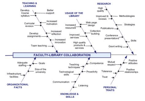
Pros: A cause-effect chart is that it helps PMs and team members anticipate problems before they arise and come up with proactive solutions to avoid wasting time and money.
Cons: A cause-effect chart has a narrow focus and doesn’t give information about other aspects of a project outside of possible roadblocks.
Ideal for: Brainstorming and problem solving.
8. Burn-up or Burn-down Project Charts
A burn-up/burn-down chart focuses on how a project is progressing. A burn-up chart shows how much work has been done, and a burn-down chart shows how much work is remaining. Either offers vital information for a PM who must hit a deadline. These charts are easy to create and can be generated automatically with some project management software solutions.
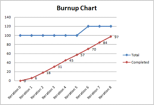
Pros: The pros of using a burn-up/burn-down chart is that it allows the PM to quickly see if the project is on track to finish on time so that he or she can make adjustments. Burn-up/burn-down charts are also easy to make changes to as the project progresses.
Cons: The cons of using a burn-up/burn-down chart is that it doesn’t show your PM which tasks are in progress and how close they are to being completed.
Ideal for: Tracking progress on projects.
9. Bar Chart
Bar charts are a classic when it comes to the visualization of data. They are simple, versatile, and easy to interpret, and you don’t need to be an expert in motion graphics software to plot them out. On one axis will be a variable that you are measuring. It could be anything from billable hours to completed tasks. On the other axis will be the units of measurement for that variable. These charts are created automatically by nearly all project management software solutions and most cloud phone systems.
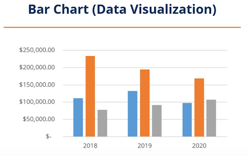
Pros: The pros of using a bar chart is that it is easy to create and interpret, and you can compile a large amount of data into something very understandable.
Cons: The cons of using a bar chart is that you can only address one specific aspect of a project at a time.
Ideal for: Visualizing a specific aspect of a project.
10. Pareto Chart
A Pareto chart combines a bar chart and a line graph. The left vertical axis will have a unit of measure, such as frequency of occurrence. In contrast, the right vertical axis will have a cumulative or total for the particular measure branch. Along the horizontal axis will be whatever variables you are measuring.
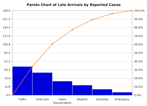
Pros: The pros of using a Pareto chart is that it includes elements of both a bar graph and a line chart so it is much easier to look at this chart and see what kind of an impact certain solutions will have on a problem. A Pareto chart can also be easily generated from a spreadsheet.
Cons: The cons of using a Pareto chart is that, similar to the cause-effect chart, it is singular in its purpose and doesn’t show the “big picture” of a project.
Ideal for: Identification of problems and complications in a project.
11. Pie Chart (Ideal Project Management Charts)
A pie chart is easy to create and can be used for a wide variety of data. A pie chart is circular (like a pie) and shows a breakdown of something as segments of the circle. It is useful when an asset, budget, or task can be logically broken down into categories and when the proportions of such types are significant.
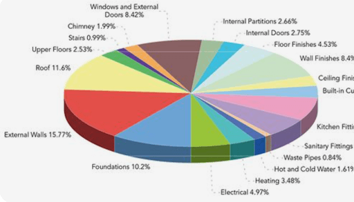
Pros: The pros of a pie chart are that it allows a PM to quickly see the impact of categories on the whole. Pie charts are also easily shared with others because they are very user friendly and most people are familiar with them.
Cons: The cons of a pie chart is that it is narrow in focus like the bar graph.
Ideal for: Data segmentation.
12. Control Chart
A control chart maps out a specific process over time. It is meant to show erratic changes quickly. The distinguishing characteristic of a control chart is that there is an upper limit and lower limit line on the graph and then an average middle line. Ideally, the process that is being tracked will remain around the average midline. Still, if it fluctuates over the upper limit or below the lower limit, the PM can quickly investigate and adjust before a problem arises.
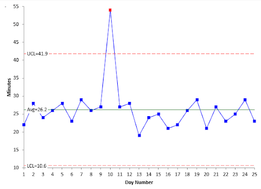
Pros: The pros of a control chart are that it provides a picture of a process over time so that you can quickly see if a task is being performed as was intended or if a tool is working correctly.
Cons: The cons of using a control chart are that it doesn’t show the cause of variation in a process, so it may create a “false alarm” if there is a common-cause variation. Another con of the control chart is that they require some training to develop and interpret. The control chart will not be helpful if the limit lines are too high or too low.
Idea for: Monitoring a specific task or process.
13. Matrix Diagram
A matrix diagram shows relationships between different elements or groups of features. There are several matrix diagrams; some compare two groups to a common standard, some compare four parts to each other, and some compare three data sets. All matrix diagrams create a visualization of how data sets are working together and related to each other.
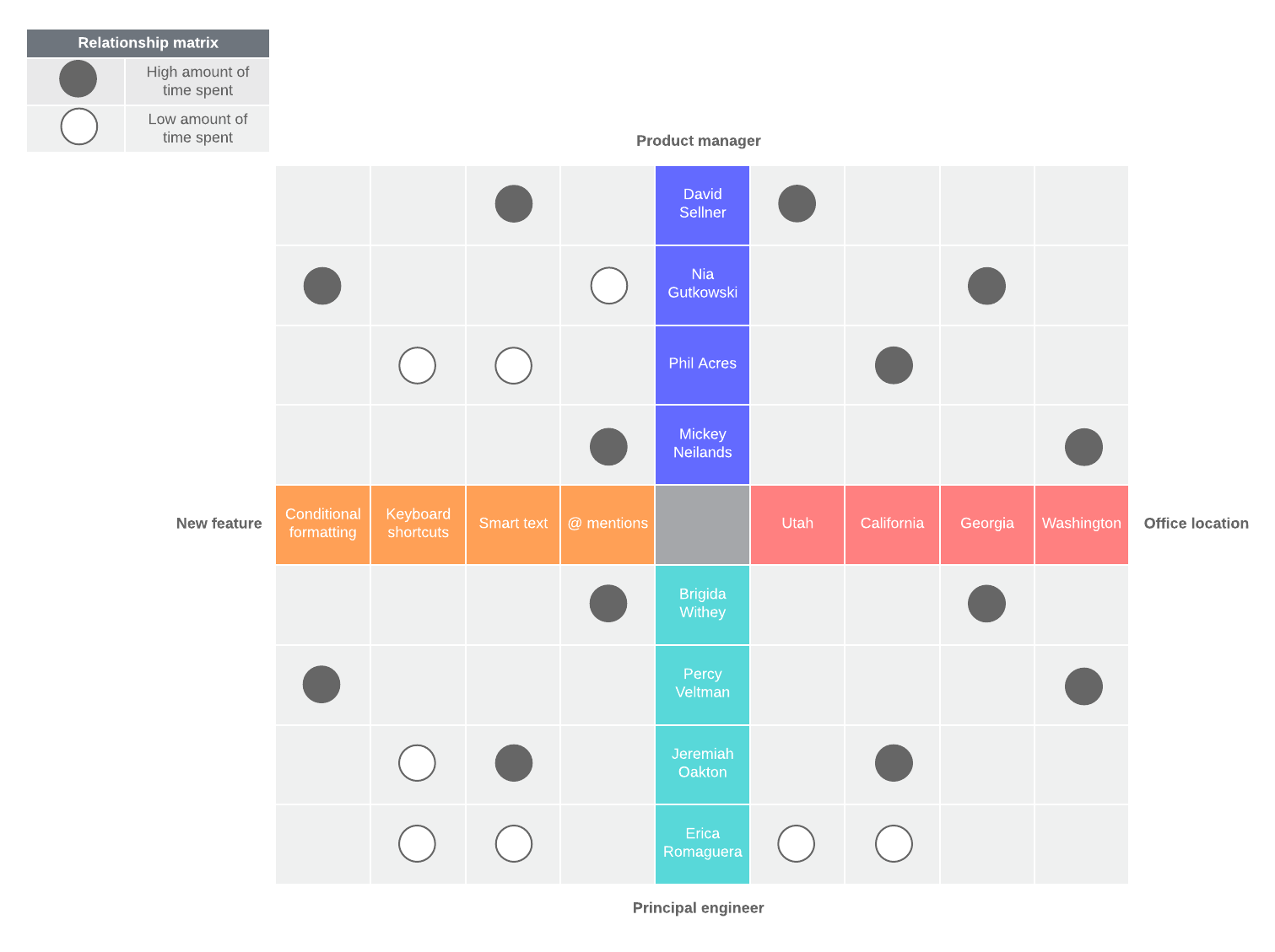
Pros: The pros of using a matrix diagram is that it is very customizable. You can choose a common format, or create your own to fit the type of data you have and your goals.
Cons: The cons of a matrix diagram is that they can be more complicated to create and are limited in scope.
Ideal for: Complex projects with many interdependent elements/processes.
14. Critical Path Diagram (CPM)
A critical path diagram shows the most important tasks involved in a project in sequence. This can help a PM visualize task duration, set a realistic deadline and budget for a project, and make sure a project stays on track to completion.
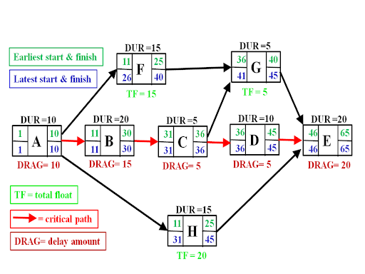
Pros: The pros of the critical path diagram are that it simplifies a project into its most essential tasks. Figuring out the time and effort needed for these vital tasks can give valuable information to the project.
Cons: If using a critical path diagram, the “critical path” must be mapped out accurately. If a crucial step is missed, this could cause significant problems later. With larger complex projects, this may not be easy to do, or the diagram may become too complex to be helpful.
Idea for: Initial project planning.
15. Cumulative Flow Project Charts (CFD)
A cumulative flow chart (CFD) gives you a visual of the work in progress, cycle time, and throughput. CFDs are generally brightly colored and visually appealing. They are similar to a burn-up chart in that they display the work done, but they give more information about different stages of tasks than a burn-up chart does.
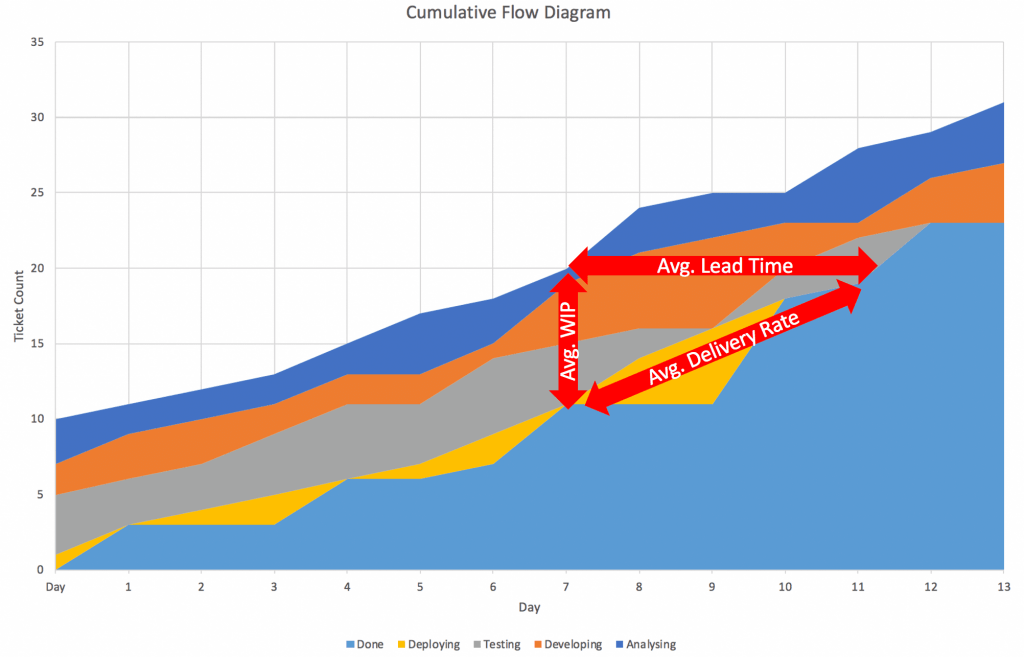
Pros: A CFD allows a PM to keep track of how the project is progressing as well as to see where the bottlenecks are at a glance. CFDs can handle very large amounts of data.
Cons: A CFD only shows historical data, so they are only useful after some time has passed and they cannot be used to predict when a project or task will be completed.
Ideal for: Identifying bottlenecks and tracking progress on long-term projects.
Advantages of using Project Charts
Let’s think about all the data that needs to be analyzed when managing a project. There are usually different employees working on other tasks with various deadlines and milestones. All of these need to be tracked.
There are also budgets for these projects. This might include research bills, labor costs, and overtime. There also might be resource allocation data that needs to be tracked. As business projects get bigger and more complex, the data load increases. Putting these data points into a project management chart simplifies things and offers several benefits.
Saving time with Project Charts
Project management charts will save your project manager and teammates time because they don’t have to manually go through large spreadsheets and data. Humans can process visuals 60,000 times faster than text. This means that your PMs can analyze more data and make more informed decisions without wasting time.
Staying on budget using Project Management Charts
Project management charts can save your company money too. With project data organized systematically, there will be fewer mistakes and uninformed decisions made in personal project management. With an accessible way to see all of the information on a project at once, there can be more eyes on the data.
Increasing success and decreasing frustration with Project Charts
With the ability to quickly understand the big picture of how a project is progressing, PMs can plan better, make better decisions, meet more deadlines, reach more milestones and deliver more successful projects.
Additionally, project management charts significantly reduce the need to comb through vast data. Time-consuming, repetitive tasks cause the most frustrating cases of burnout among employees.
Final Thoughts on Project Charts
All the project charts mentioned above help compress large amounts of data into something easy to understand at a glance, but they all serve different purposes. For complex projects, it will be most helpful to use a variety of project management charts to understand how the project is progressing entirely, what issues need to be addressed, and whether the project is on track to come in on time and under budget.